I have always loved the intensity of Vincent Van Gogh’s paintings, the subjects he chooses, his thick brushstrokes and his use of colour.
Born in Zundert, in the south of the Netherlands on the 30th March 1853, his tragic life was often misunderstood and he was seen by many as a mad man. However, he had a close relationship with his brother Theo. Theo describes him as a “A soul, storm-tossed and passionate, ever the prey of sorrow and despair. Yet a creature, in spite of it all, capable of selflessness and heroic devotion” (Master’s of Modern Art - Van Gogh Page 45). After reading the book “The Yellow House - Van Gogh, Gauguin and Nine Turbulent Weeks in Provence” by Martin Gayford, I developed insights about his life in Arles when he actually lived in the Yellow House (1888-1889). This was a productive period in his life and he painted 76 pictures often turning out two canvases a day including portraits of local characters, sunflowers, his bedroom, chairs, and night scenes.
There are a number of accounts that he suffered from seizures, hallucinations, manic depression (bipolar disorder as we know it today) and a number of other health issues that plagued him all his life. Fearing another attack of insanity Vincent shot himself in the chest and died two days later in the village of Auvers-sur-Oise in northern France on the 29th July, 1890. He was 37 years old. A man of genius who sold one painting in his lifetime, The Red Vineyard, painted in 1888.
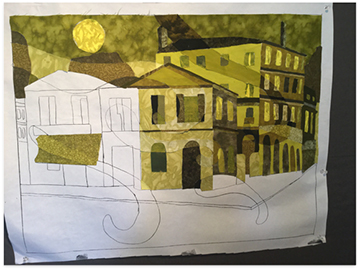
“Van Gogh in Yellow” was inspired from Van Gogh’s paintings “The Yellow House” painted in Arles in May 1888 and the brushstrokes of the painting “The Starry Night” painted in 1889.
Van Gogh’s signature colour yellow would be my chosen monochromatic colour scheme, but this would be a cool yellow as it spoke to me of the night, melancholy and a lonely intensity that a warm yellow doesn’t have. I superimposed the idea of swirly shapes of the starry night onto the pattern. These shapes would be the ghost images that would float over the design.
Choosing the right value for each section was important to get the ghost image. With each piece I made a freezer paper template and with a glue stick placed a suitable fabric on the paper pattern. For example the canopy over the shop has a medium value but the ghost section on the canopy has a lighter value. I put 5 ghost marks into the pattern and made 3 of them lighter and 2 darker. To get the effect of the ghost layers I used a technique by Katie Pasquini Masopust from her book “Ghost Layers and Color Washes” (2000). She has wonderful instructions and enabled me to get the look I wanted using colour values.
Blind hem machine stitching (edges turned under) onto tearaway stabilizer. Again a technique by Katie Pasquini Masopust.
Piece by piece, section by section.
Quilting piece by piece, section by section.
The Yellow book with quotes that resonated with me about Van Gogh, an homage to the artist, and a connection to my finished work “Van Gogh in Yellow.”


